This area does not yet contain any content.

Entries in colour (325)

Tuesday
Nov282017

A bold renovation of an apartment in Venice
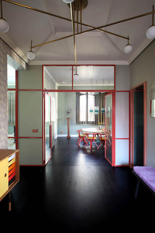
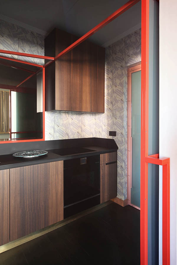
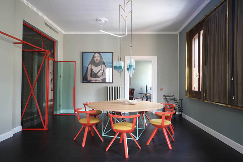
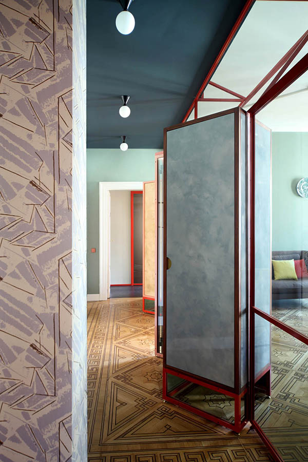
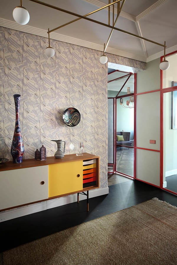
Here is another project by the incredibly talented Italian architecture and design firm Marcante - Testa (previous one here) that I had to share because it is a work of art. Honestly I am blown away by this. A few details: This is the renovation of the communal areas of a 19th-century building facing a small canal in Sestiere San Marco, and one of its apartments. Prior to the project the building was completely without decorative-architectural features appropriate to its character. The project for this apartment develops through diaphragm-dividers with structures in painted metal and brass, infill elements in green glass and wooden panels treated with Venetian stucco: inspired by the intervention of Carlo Scarpa at Ca’ Foscari, the dividers conserve natural lighting even in the areas without windows. Inside the rooms, the relationship between the windows and the Venetian landscape is reinforced by a system of brass frames with gilded curtains of metal screen, that act to determine precisely revised openings towards the outside in a sort of continuous ribbon window through all the spaces. Through the glass of the lamps, the wallpapers with a shaded effect, the colors of the walls, all the way to the choice of the furnishings (like the glass tables or the iridescent carpet), the project sets out to interpret and incorporate the Venetian landscape, the lagoon and its colors. I have no words for the mind-blowing attention to detail here, and the bold choices in colours and patterns. This project is so inspiring, and brings creativity and eclecticism to a whole other level. Photos: Carola Ripamonti
Click to read more ...

Friday
Nov242017

Fun colours in an apartment in Milan

A huge thanks to Edward for sending us a link that led us to Italian architecture and design firm Marcante - Testa (formerly UdA that I was a huge fan of and featured several projects here). They kindly sent over photos of all of their residential projects and OH LA LA!!! Lots of good stuff but this 150 m2 apartment in Milan might be my favourite. In love with the unique paint combinations, the flooring (including the painted detail) and the fun wallpapers. LE TEMPS RETROUVÉThe visual relationship with nature was the guiding motivation behind the choice of this place on the part of the client. Materials like wicker, Vienna straw and linen that form seats, accessorized dividers, wardrobe doors, the fake marble laminate of the kitchen table, the wicker headboards of the beds, join forces to stimulate memories of spaces, perhaps experienced in a "grandmother’s house", reinterpreted here and rendered functional for contemporary needs. A "light" project made of decoration and furnishings (vintage and custom) for a house to make on a tight schedule and a suitable budget for a rental, where the architectural structure of the building has not been altered, though its spatial perception has been improved. The view of the spaces changes and varies depending on the chromatic contrasts on the walls, using resin for the floors that partially covers the wood to become a “carpet” to mark the position of the table and its chairs. Sourcing details are here. Photos: Carola Ripamonti

Click to read more ...

Wednesday
Nov222017

A family-friendly and colourful townhouse in the West Village

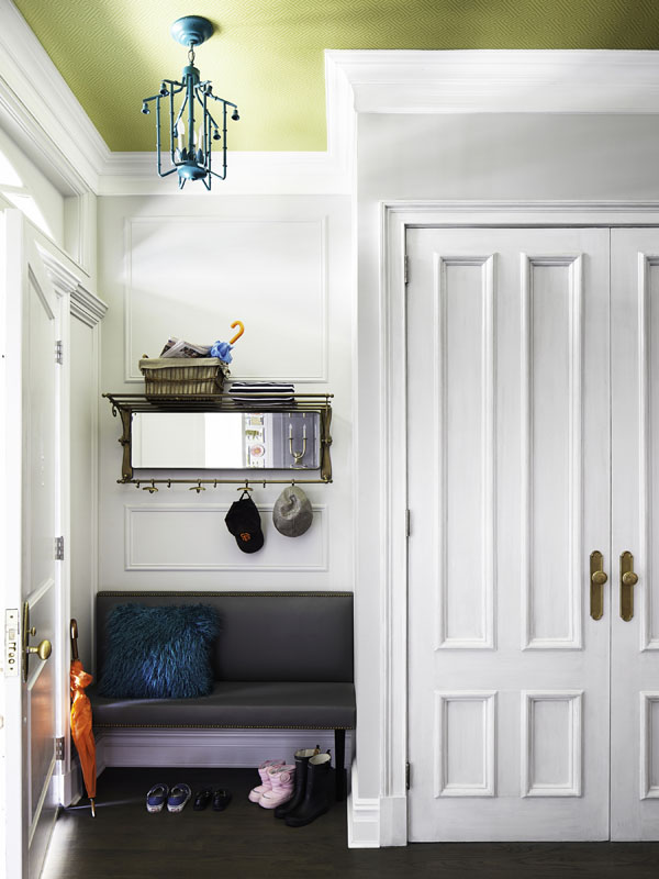
There is nothing I appreciate more than an old home with its original details maintained after a renovation, like in this West Village townhouse by Rob Stuart. This fearless family yearned for a color infused, yet calming, fresh design all with the detail and nuance of a rarified turn of the century townhouse. Vintage mantles, layered moldings, patterned wallpapers and colorful fabrics come together in this family friendly home. We nudged various walls slightly throughout the floor plan to provide for a more spacious feel. I am head over heels with this little foyer in the photo above. I love the bold yellow wallpaper for the ceiling paired with the teal light fixture. It's an unexpected pairing with the rest of the traditional details. 

Click to read more ...

Friday
Nov172017

A bright, playful home

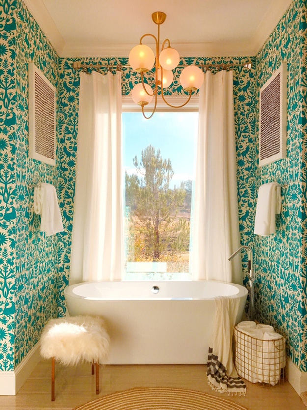
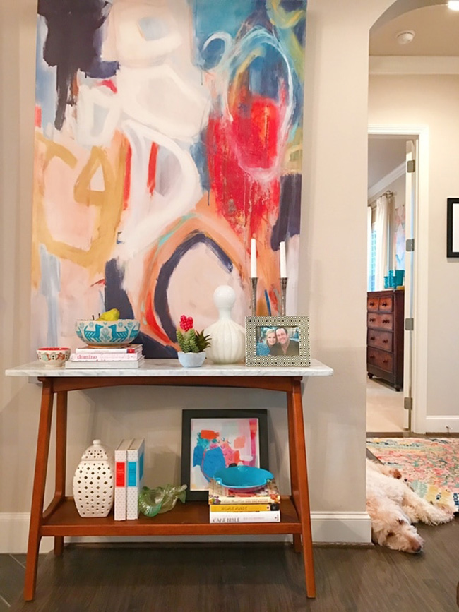
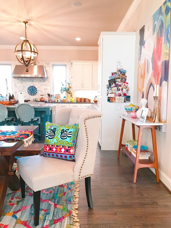
Neutral walls and floors call for bold accessorizing. In this case Shauna Glenn went all out in the colour and pattern department to turn her home from bland into WOW!!! I had to start this post off with her bathroom because it is drop dead gorgeous!

Click to read more ...

Tuesday
Nov142017

An open concept mid-century remodel 

Now this is one seriously cool remodel. It is so good I sent some photos of the kitchen to one of my sisters who is looking to renovate hers soon. I hope to gawd hers ends up looking similar. Not many kitchens have a little funk like this one. Kudos to Veneer Designs on a job really well done. Let's start with a before photo:

Look at it now!

A recently transplanted couple of creatives, who were also expecting twins during the remodel, had a clear vision of how to update and refine their post and beam home tucked into the treetops of Pacific Palisades. Taking cues from nature as well as the home's architecture, an earthy and brave interpretation of midcentury design was applied to the new kitchen layout and adjoining spaces.  Mahogany cabinets with color blocking, red oak rift cut wall paneling, epoxy floors, glazed thin brick specialty tile, and ceramic light pendants commissioned from Heather Rosenman come together to create a unique composition. (Photos: Amy Bartlam)

Click to read more ...