This area does not yet contain any content.

Entries in dilemma (113)

Friday
Jan162009

Chesterfield makeover

Georgia wrote looking for some inspiration for a project: "I have inherited and begun to restore a lovely old chesterfield couch belonging to a recently deceased great uncle. It's a labour of love and I want to love it and pass it on after me. Do you have any images of restored chesterfields? I think I want to step away from that men's club vibe and modernise it somehow with the covering... any input would be amazing. I think I'm heading away from tufting though, in an effort to modernise and simplify (the upholsterer gave me the biggest smile when i decided this, less work for him). I'm not having much luck locating images of nice revamped chesterfields (leather or otherwise) without the tufting... do you know of any?"

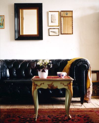
Now I don't have a photo of Georgia's chesterfield, but the photo below is what I always envision when I hear the word chesterfield. Leather, black (or brown) with thick rounded arms and lots of tufting in the back.


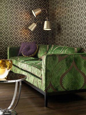
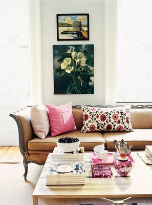
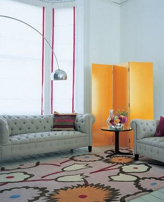
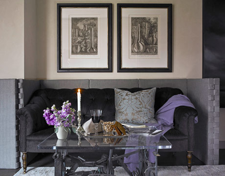
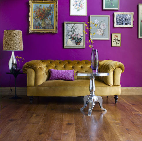
I was a bit disappointed I've got to say that she may forgo the tufting, because I think the tufting is the best part, but if it means keeping your upholsterer happy and your wallet a bit thicker... Anyway, it was difficult finding photos pf chesterfields without tufting, so below I've included a wide variety of photos to inspire Georgia. Some aren't quite chesterfields but they have fabulous upholstery, and some are tufted but you'll just have to imagine the upholstery without the tufting. I am envisioning velvet, maybe charcoal grey for it's versatility since this is going to be a piece passed along. I do have to say that the first one below has to be one of the most incredible chesterfield-like sofas I've ever seen. I'm not sure about the lavender but the unfinished style is totally knock-your-socks-off drop-dead gorgeous.
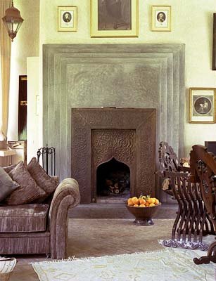

Angus McRitchieLucinda Symons
Sean MyersDomino
Suzy HoodlessThe Rug Company
elledecoJoe Schmelzer


Wednesday
Dec242008

Claire needs help

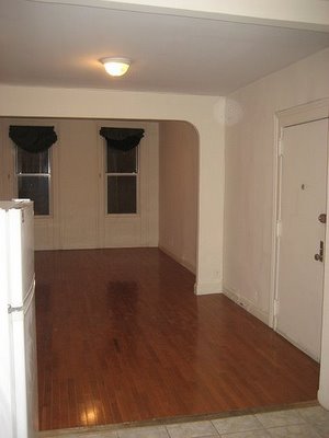
Claire emailed us recently in the hopes we could help her out. Here's what she had to say: "I've seen you lend a helping hand to several readers with designing dilemmas and I was hoping for a bit of help myself. I just signed the lease on a wonderful studio-type apartment near Dumbo in Brooklyn. Now I say "studio-type" because it feels more like 3 rooms connected to create a long living space and although I know it has loads of potential, I'm struggling with where to start! Should I paint the entire space one color? If I do different colors for each space will that be too much? What about a gradient going from ochre in the 'bedroom' to a paler yellow in the kitchen? I also have to reckon with my boyfriend's tastes - not that they're bad - but I have to make sure that it doesn't seem to girly or to 'me'. Do you have any pictures in your arsenal that could be inspiring for this project?" Below are a couple photos from Flickr she has of the apartment.


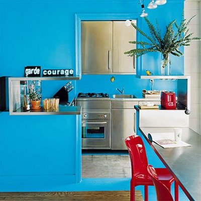
Why Claire, I think I may have found a few photos to inspire the design genius in you! Admittedly, it was a bit tough finding photos of rooms that are connected but have a little bit of a separation with walls. My gut is telling me that bright white all over and working some magic with art and furnishings would be an easy fix. I don't think I would do different colours - the apartment isn't very large and having each space a different colour would make it appear smaller. If you aren't into white (or a light grey, my fav), I would select a colour (I'd keep it light) and then pick the 2 shades next to it on the paint chip - similar to what you are suggesting with the yellow to ochre. I think the subtle change in shade from room to room would have a really nice effect, and would keep the spaces flowing. I am including some photos of different colours in each space as well, in case you choose to ignore me (that's been known to happen). And please folks, leave a comment if you have some thoughts on this. Help a girl in design distress.

William MeppemInspace Locations
Aine CluneHarry Allen
Dominoelledeco

Monday
Nov102008

Orange inspiration

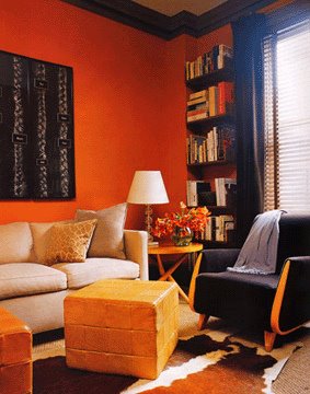
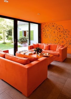
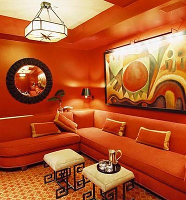
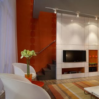
Robin emailed the other day looking for some colour inspiration: "I was wondering if you could dig up some photos of orange rooms. I painted my living room a clay orange to match a fabric I love and now I’ve lost the orange inspiration! Help!" I dug up some photos of spaces with orangey walls to hopefully help Robin finish her living room. Note: grey, white, taupe and chartreuse seems to be popular choices to use with orange.

Apartment TherapySteve Learner
Bo BedreApartment Therapy
White WebbTocar Interior Design
30E designApartment Therapy
Bo Bedrekontakt magazine
Côté MaisonDelson or Sherman Architects
Image LocationsMaison Jardin
Michael RobinsonMark Lund
Michael WellsMichael Robinson
New York SpacesII BY IV

Monday
Aug252008

Andrea and the lake house

Andrea wrote us the other day looking for some advice, and instead of us emailing her back I figured this might be a fun one for our readers to help with as well.

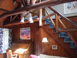
"My partner is buying a lake house. There is a lot of room for improvement and I'm very excited about making my ideas come through. But there will be very little cash after the closing, so we might be doing some of it ourselves.

The house is very dark because of ceilings and walls are covered with dark stained pecky cypress. So I thought about either sanding it back to the natural color or white wash them. I know to white wash I'll have to take the finish off, which might be very tiring. I think sanding is going to be very painful, even with an electric sanding machine. I heard of corn cob blasting, but I don't know if that can be used for interiors. We plan to rip out the carpets, redo the floors, take off the wall paper, etc.

But what makes me sad is the kitchen. Although the sellers put good money on it having top appliances, new cabinets and countertop, the colors feel horrible to me. We cannot have new counter tops at the moment and I'm just unsure on how I'm going to neutralize the horrible corian bluish green countertops. I thought at first, about staining the cabinets in red and placing a backsplash with little mosaic glass tiles in white and light aqua blue. Then I thought it would be better do reverse for white cabinets and red mosaic glass tiles.

What I'm going for is a overall natural look with lots of wood, but on the lighter side. I hate darkness give by dark browns and red browns. It makes me feel sick. I was hoping you would have some suggestions about these issues. These pics were taken by me. The house is in Ringwood, NJ."

Andrea, the house is AMAZING!!! It has a ton of potential. I am very excited to hear you are getting rid of the carpets (YUCK). I have a couple of suggestions for you, and hopefully our readers will have a few as well for you to mull over.

I LOVE painting wood white when the colour/effect isn't so hot as it is. This lake house would look like a DREAM, IMHO, if all the walls were painted white and whatever wood flooring you chose was painted white as well (white-washing would be great too but would be ALOOOOOOT of work). It would add so much more of a modern feel to the existing rustic look. I'd leave all the beams and railing as is. I think the stone fireplace would look great against white. As for the kitchen, I would paint out the cabinets white. To me red works on glossy flat-faced cabinets for an ultra-modern feel. I don't think red would suit the existing style of the doors. If there is any way you could remove the trim along the tops of the cabinets, because they are huge and break up the space alot, or replace them with something smaller. Also, the trim over the windows could go too. If you must keep the existing countertop (perhaps you could look into a laminate or butcherblock though, might be affordable), then I would select a tile that has that colour in it - like a mosaic of blues/greens, so the countertop makes a bit of sense and blends in. The appliances are incredible - you are so lucky to get to save money there.

That's enough rambling for me. Andrea, I hope you and your partner have fun with it and if anyone has some suggestions, comments are always welcome.

Thursday
Aug212008

Entry hall inspiration


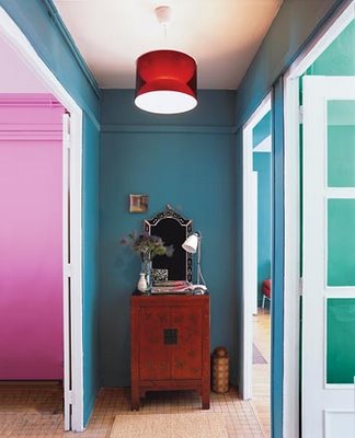
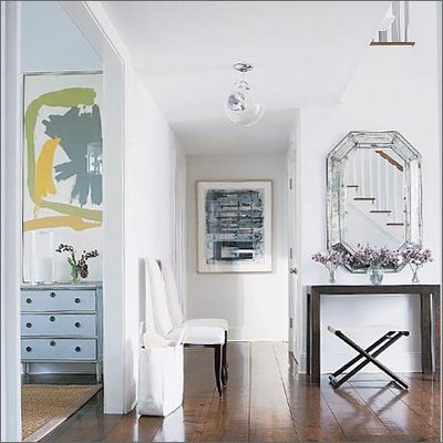
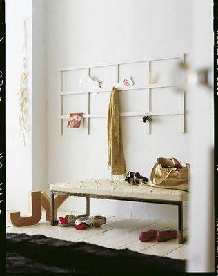
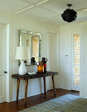
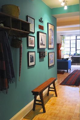
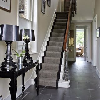
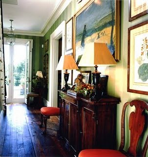
Ashley emailed looking for a bit 'o inspiration: "I was hoping you could do a post on entry halls. Right now my entry hall is beige and is in some serious need of change. Everything I keep finding is the outside entry, not interior. I can't seem to find much in the way of examples, but you guys are the experts ;)". Many people may overlook their entrance hall or just focus on it's function rather than the design but HELLO????, it's the first thing people see when they walk in your home. So I'm happy to hear Ashley wants to spice up her boring entry. Ashley, I hope these photos help you to banish the bland beige and spice things up. (Note: My favourites are above)

Living Etc.
Living Etc.
Robert Stilin
Apartment Therapy
PointClickHome
Ledbetter Fullerton Architects
Light Locations
Sköna hem
Living Etc.
Robyn Karp
Domino
Domino
HGTV
Home Portfolio
House to Home
House to Home
Living Etc.
Miles Redd