This area does not yet contain any content.

Entries in children's rooms (57)

Friday
Jan112013

Reader's home - Nelly's daughter's nursery

This is the first of 2 posts I have for you today that take you into the homes of a couple of our readers. Nelly (a stylist whose work I have featured here, here and here) sent in photos of her daughter's adorable nursery.
I was blessed with a massive room with beautiful floorboards and a decorative fireplace, but I had a very tiny budget. As a result, all furniture are second-hand (including the much-loved rocker) and most decorative items were handmade by family and friends or sourced on Etsy and/or overseas. I'd put a maximal limit of $100 for each piece of furniture and $30 for any decorative items. I only "splurged" on the cocktaoo ceramic lamp ($75) as I had eyed it with envy for a few years... You might notice that I have again used a cow hide. Well, it just happens to be the same that was featured in other of my rooms/shots. It no longer fits into my "new" home (not that new; it's an old cottage in a heritage listed suburb of Perth), except in my daughter's. And as I don't really have the financial resources to invest in another rug at the moment, well, I've used it!

Wednesday
Dec192012

Meta Interiors

Clean, contemporary lines with a base of neutrals strengthened with sophisticated colour choices. A simple, modern nursery layered with texture and pattern with surprising but not overpowering orange and pink colour accents. A room that is functional and stylish. Not at all twee. An apartment which plays with scale and texture softly embellished with pastel blues. Beautiful interiors by Chantal Spanicciati of Meta Interiors.

Click to read more ...

Thursday
Jul192012

Parents' retreat

Something a little different for today's post. The Melbourne Central Parents' Retreat by Clare Cousins Architects.

"The brief called for three key zones: a wet area for toileting/baby change; a feeding/play area; and a retreat lounge as a waiting or alternative feeding area. While the project required a highly practical solution, ensuring children's safety, adequate sight lines, and low-maintenance wet areas, for example, the emphasis is on peace and play. This is not a utility space, which is used and then left; rather, it encourages people to linger, children to play and parents to recharge. Key to the concept was the aim to preference local suppliers, and to use low-tech and sustainable materials, with bespoke play equipment unique to the project. A vibrant colour palette delineates and connects zones for easy navigation, while the custom-designed play equipment entices children to engage with the space physically."

It's fun and fab, a touch of practical luxury and leisure in an often utilitarian and frankly boring space. No "tuck them away way down the back and forget about them" but a celebration of young children and their parents, a welcome respite from the bustle of the crowds. (Photography by Shannon McGrath.)

Tuesday
Jul172012

Incorporated - part 1

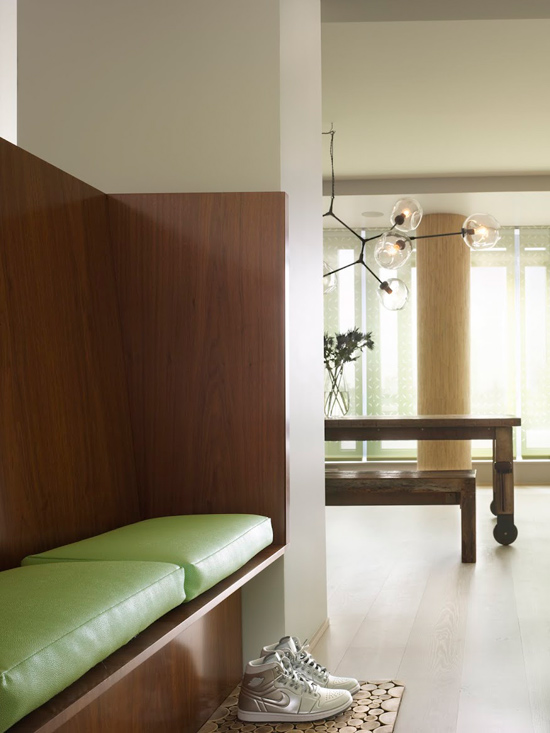
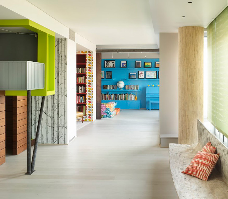
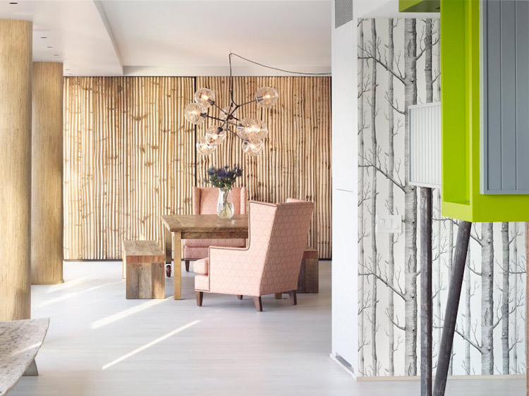
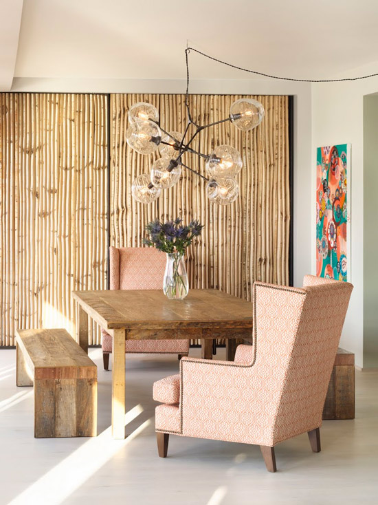
My twin sister sent me the link to the architecture and design firm of Incorporated, based in New York, and the heart palpitations began the second I started peeking through their residential portfolio. These guys are the shit. Seriously. This apartment they call bohemian, is the coolest thing I've seen in a long time. I don't even know where to begin. Its space after space of awe and wonder.  

Let's start with the dining room, and the birch sliding screen. It's a work of art in itself and the perfect backdrop for the rough wood table. And then to mix things up unexpectedly, a couple granny-ish wing chairs. And if that wasn't enough to stop your heart, an Adelman fixture rounds off the space.   

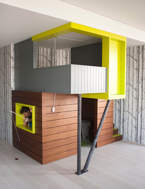
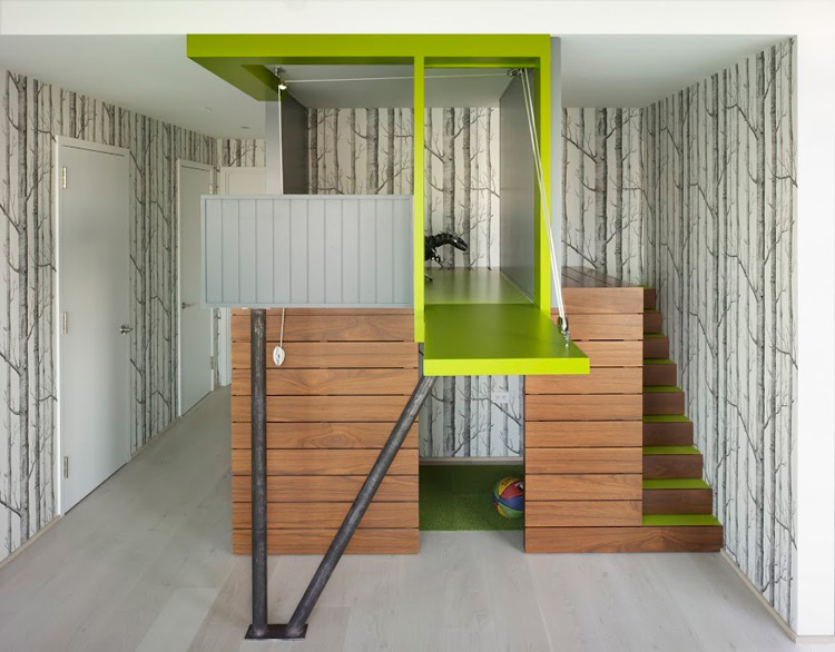
The owners must REALLY love their kids, because there is a playhouse in the middle of the apartment. And it's wrapped in the infamous Cole & Sons Woods to make it look like a tree house. *insert big smile here*

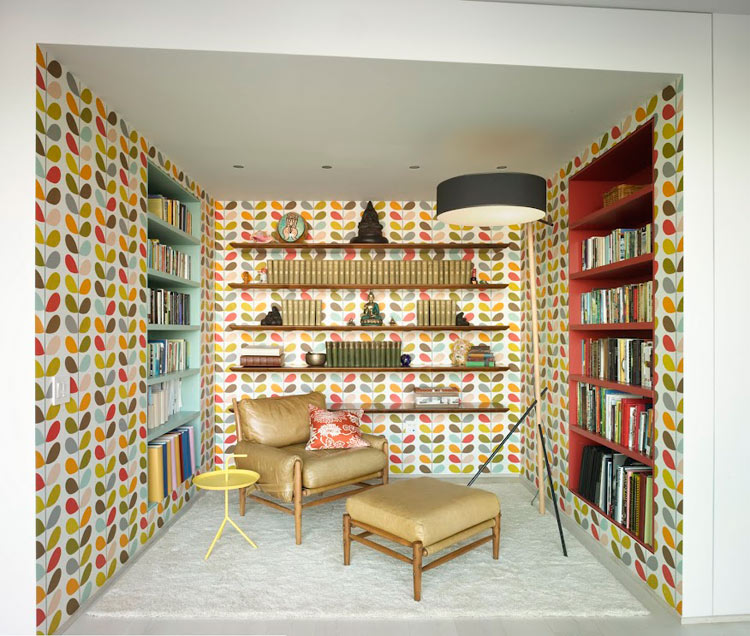
*insert even bigger smile here* This is my dream room. A retro niche to sit back and enjoy a book, swathed in Orla Kiely's multi-stem wallpaper because having such a niche wasn't cool enough. 

Click to read more ...

Tuesday
May082012

Confection perfection

Soft and fresh. Whimsy matched with confidence. Comfort and a place of refuge but with personality and playfulness. Part grown up, part fantasy but always the perfect place to hang with friends or chill out. This teenage girl's room in the Pasadena Showcase House of By interior designer Maya Williams. Beautiful details, sophisticated yet youthful colours. It's a room fit for a princess and just right for a stylish young thing.

Click to read more ...

Page 1 ... 6 7 8 9 10 ... 12 Next 5 Entries »