


Wednesday
Jan252012
Bizarre
 KiM
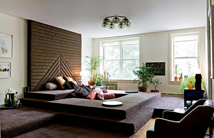
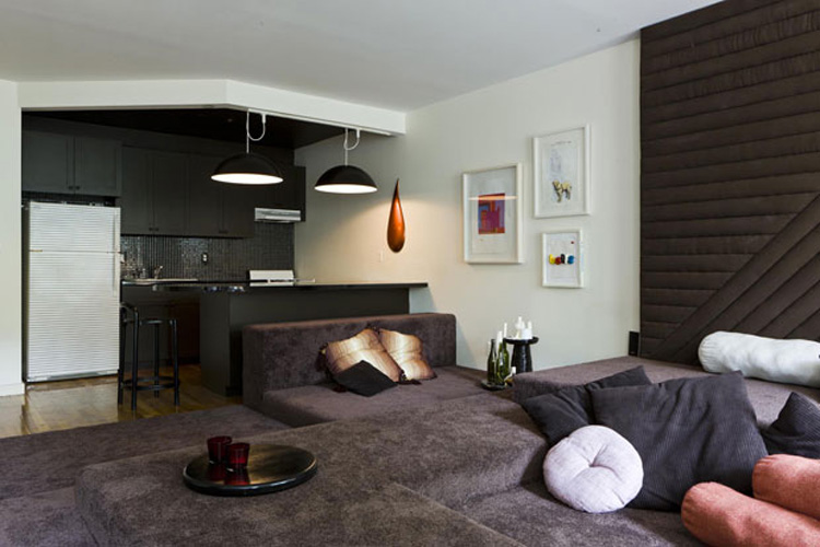
KiMI came across the following photos on AT Casa and had a good laugh. Now, I think conversation pits are cool, especially coming across the one I blogged about here via Linebox Studio that I'm desperately hoping will be do-able in my new home. But a huge, fully carpeted one is just so....70s. And kind of ugly. No offense to Jason Miller, furniture designer and owner of this lovely shag pit he created in his 600 sq. ft apartment in Brooklyn. But really? (I found more details here).

Reader Comments (22)
It's very clever - but I think the brown (while practical) is what makes me think it's so 70s. A great use of a small space!
Confortable for kids. Maybe for their rooms. No shoes, of course!
He has 600 sq ft and this is how he uses it? Interesting.
So much wasted space! And that thing on the wall!
This doesn't even look comfortable plus carpeting is the worst.
Carpeting has chemicals, dust mites and other ghastly things bad for adults, kids and pets.
I agree, it definitely has a 70s vibe! But it would be way more comfy to sit on than the wood steps featured in the LineBox Studio. The LineBox Studio one looks so fabulous but I would likely never-ever sit there - to hard on the ol' back and butt!
Hideous. I checked out the other photos in the article and the rest of the space is pretty hideous, as well. Even his famous Antler Chandelier looks diminished among this mess.
HOW RUDE!
It so artsy-frat. Maybe there are empty beer cases under there. To me 600 squ. ft is not teeny tiny. He could have used this space better, but he's so cute, I forgive him.
The client requested an overdose of padding? There are so many things wrong with this room. Glorifies every other post you've shared. Ever.
I absolutely LOVE this room! Such an authentic ode to the 70's and really cool statement. It's a really clever way to personalize an otherwise boring, and quite ugly rental apartment. I loved the whole thing. Super chic, stylish, well done and cheap to do. A great inspiration and attainable luxury.
Too funny, I can't help but stare!
Well, it has a point of view and looks fairly liveable. Plus it's pretty much plywood, poly fill and cheap carpet, so why not try it out for a while? I do wonder if he thought it would be a shag-palace. Not likely. I suppose I like this better than good taste should allow.
My cats would LOVE this! Imagine the claw sharpening and the lolling about, the chasing, play fighting and sleeping that could happen, all in one space!
Happy to see someone say "Really?" I find myself saying that a lot these days. Guess I'm getting old and crotchety.
Ummm.......
I kind of have mixed feelings about this place too, but I have to say that as a loyal reader of this blog I was disappointed to read a post whose sole purpose was to criticize the design. This is desire to INSPIRE. This is the stuff you LIKE. So much so in fact that you want to share it with the world. I think a critical comment or two is ok if it's in the context of a positive entry, but as a designer myself, I would hate to see pics of my stuff posted on such a popular blog just to be made fun of by the author. Other than that, keep up the good work!
Excuse me, but not so long ago, we would have considered the mid century orange/brown /beige or blue/ navy/turquoise optical wall papers and fabrics rather gross. Many of the really expensive, again, mid century, now considered classics pieces, would have been, at best overlooked in a charity shop. I remember when flares where laughed at and, even more recently, high rise pants and shoulder padding frowned upon. Taste is a very fickle thing and it has a tendency to change. I'm not saying I love this decor, or hate it but I can't knock the element of fun and... originality. Beware that style could come back!
Well, love it or hate it, I do not think it was the best use of his small space.
When I think conversation pit, I don't think 'step'. The idea is luxury - which this isn't. I think the problem is that the concept wasn't taken far enough, it didn't take the dimentions of the human body into consideration. The levels should have been twice as deep, so that lounging and sitting would be more comfortable, and I'm pretty certain that a lot of the complaints would be removed if more than one color of carpeting had been used! But as a masculine boho space, I think it's excellent. The deco is spot on. It's a good attempt at something unique.
oh yeah that's clever...you walk UP to then step DOWN into the pit. Duh ! Next time he should try working in an appropriate sized space to achieve the idea. FAIL.
"Levels Jerry!"