


Wednesday
May052010
Joel Sanders
 KiM
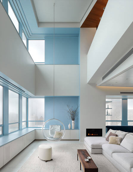
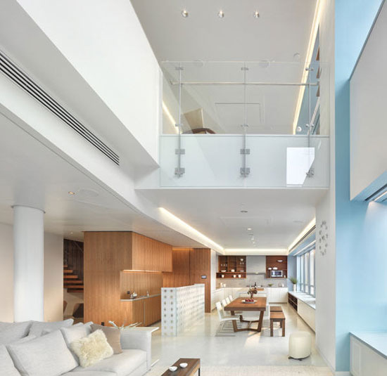
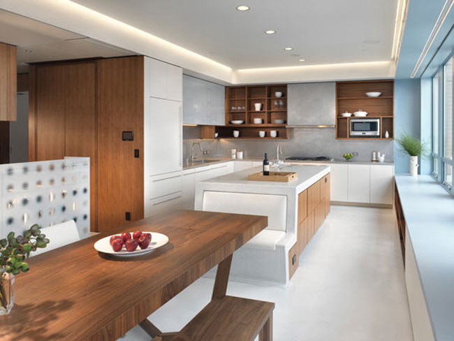
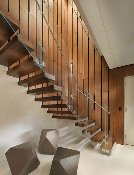
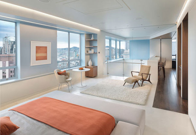
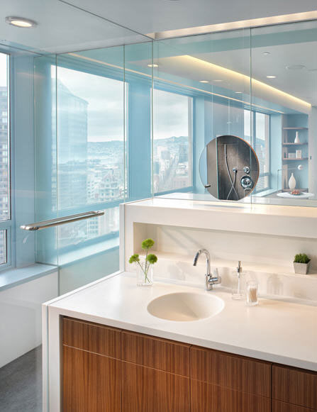
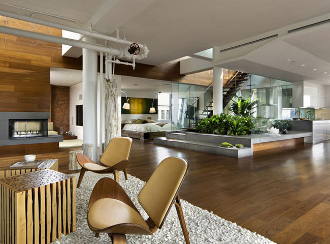
KiMHow about a little bit of modern with a smidge of mid-century for your Wednesday afternoon? I've got just the thing for you if you're like me and the mention of "modern" and "mid-century" makes your heart flutter. Joel Sanders, Architect is based in NYC and the firm has won countless awards and been featured in The New York Times, Dwell, Wallpaper* and Interior Design. Below are photos from a couple of their projects, the fist group being a San Francisco duplex penthouse that is to die for, and following that is a New York loft renovation that includes an indoor urban garden.


Reader Comments (24)
I am absolutely in love with that SF home. GAWD. love. So great. Thank you for sharing.
Simple and beautiful. I love it.
I am loving the last couple posts you have done.. I would like to live in them all!!!
Carissa
Absolutely a dreamless & gorgeous work of art. Takes my breathe away. Thanks for sharing.
Love the hanging ball chair in the first photo!
my jaw is on the floor. these rooms totally define my style. i love. i'm jealous...
I love the glass lined staircase. Just wanted to say Hi because I recently discovered your blog and it has been very inspiring. :)
Beautiful. Lovely to see a "modern midcentury" home that is seamless, rather than looking like a bunch of Eames chairs plunked down haphazardly.
Love the photo with the staircase.
Love the white & blue sky apartment. Just dreamy :)
white and blue together is perfection!
my mouth is literally agape - wow!! the plants in the middle - to die for! and all that light, so gorgeous.
The bed in such an open space is probably a really bad idea.
You'd need to be a naturally early riser, Sleeping in would be a cow with all that light coming in, then you'd always have to have
the bed made. and what if you're sick and need to be in bed while your parner is having a party?
I'd far rather be in a small, comfortable bedroom where if I can sleep in, all I need to do is pull down my blind.
The 11th picture seems to show an extremely tight seating arrangement up against the wall too.
They didn't show where the toilet was, but I bet it's located next to the bath.
This house looks nice, but is not practical.
those stairs are to.die.for.
jealous.
lindsey
I have to say, personally, I would have to hang myself if I had to live in this space.. Too sterile and plain.. Granted it does have design, and if very well put together, just isn't for me. Guess my mind works too much, need distractions... Kudos for the design outcome. Everyone needs different environment!
How much does this place cost? I mean, what kind of salary am I shooting for?
Sorry, but to me it's a bit boring. It's too plastic. Not homelty at all.
maaaaaaaaaaan these are all AMAZING
2 Kool
The SF house makes my nipples hard.
I'm not sure about the blue. With the pure white it makes the space feel sterile, like a hospital.
Difficult to say which is the best. Each one is inspiring wants one to remodel. Natural light is at its best.
All the shots are really very amazing; i like the combo of orange with light blue and greenery in the living room area.
That bench on the end of the island is so smart! I usually don't like banquette seating in homes, but I love this design!