Wednesday
Feb042009
Bathing Beauties

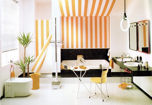
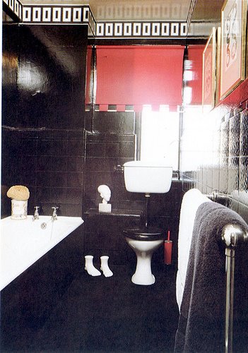
Nothing dates a house more than an outmoded bathroom (that and an aging kitchen). I couldn't resist posting these 80s bathing beauties. Come on! What's not to love? In 25 words or less "Why I hate these rooms". Your time starts now. Making the most of Bedrooms & Bathrooms, by Mary Gilliatt, Orbis Publishing, London, 1983 is the source.


 Wed, 4 Feb 2009


Reader Comments (20)
The preponderance of drippy foliage, the brown and black tiling, the bad artwork and gimmicky furnishings. And only 15 words necessary.
We have just signed a contract on a house with a bathroom blacker than either of those two! The previous owners must have had this book. It is going to have to go - fast.
Miss Ripley's concise 15 words were pretty much my summary too.
Clare
Bulbous vanity lights. Excessive tub decking. Black toilet seat (reminiscent of school bathrooms). Scalloped, lace shower curtain. Brass "plant" holders. Disgusting looking plants. Eeew. Eeew.
I admit I can tolerate the first one, though one wonders what goes on at that cafe table with the clock on it. Sporting event? The size of most of these rooms, and the depressing 70s slanted ceilings, all scream "suburban subdivision." But mainly you get the creepy feeling that these bathrooms have been designed by the kitschy tropical houseplants themselves, for their own special purposes. They're obviously the ones who put in that trellis.
Old school ! It looks like they tried to gather in a small room all the bad taste of the 80’s ! (Excuse my french … I guess the terms might not be the good ones).
In thinking of Limo floor and even walls ! Neon lights, lambri (Ho my god I hate those long pieces of wood on walls !). The futurist style isn’t getting old easily I guess. To your opinion, what kind of nowadays popular design that might be featured in a magazine in 30 years as one of the 2009 bad taste example?
hmm i thought the third room down had a certain charm to it... actually on second thoughts... the ferns :|
We hate that they all reek of
1983. And we loved 1983!
i actually liked the stripes.
1) great light! stripes are cute. What is with that doctors office scale in there?!
2)I like the light from that window - why kill it with all that black? Although the mushroom print is sweet, the michelin man statue is not.
3)needs the ferns removed and updated artwork.
4) why do you have a toilet cleaner in a decorating book photo? Get rid of the fern and update the handles.
5)everything is wrong with this. This makes me want to barf. plants, chair, how everything looks dirty.
6)creepy.
7)there are too many ugly themes.
8)There is something kind of awesome about how weird this is. There is even trellis outside the window.
The end.
Too dark, too decorated, too much, too too.
WOW!!! Lovely. I love the steps to the tub with the lovely plants around it!! Great! Thanks
I have always wanted a black bathroom....a modern black one...sigh.
I actually like all of these (well, at least parts of each) except for the all-white one with the plants. EEKK.
I'm a silent, yet religious reader of this blog, but this time I had to speak up. I looove these 80's bathrooms. And not just to look at, but to have in my apt. My favorites are the first one (love the yellow and black), the second one (love the sink and toilet), the one with the red and white striped curtain and plastic door handles (obsessed), the black and red one that actually looks like it's from the 20's, and the one with the awesome brown-dot-school-floor crawling up the wall. I need to get that book!
Quite fond of the first room! Except for that neon hoop light thing- that can definitely go....and the toilet. The rest I can live with.
I love the way that #7 steps your naked body right up to window so that only your ankles have modesty. I bet the neighbors looooved that. Especially imagining the contortions you would have to perform to get into the sunken tub.
If each picture was restyled with some modern accessories - my bet is we all swoon over them!
Oh & I would take bathroom #1 as is!
I think that last bathroom with the green and white walls is just adorable - would lose the floral curtains though! Tracey xx
My Barbie had a bathroom that looked just like the last pic, only it was primarily in blues.
Kim
1. ok, different light
2. toss the plants
3. toss the plants, get a different mirror, paint the vanity gray
4. paint the horizontal boards gray, make everything red white
5.Toss every plant except the ivy, get a different shower curtain.
6 get rid of those black gloss walls. Maybe do a stripe or white
7. toss all the plants. Get a cute modern print roman shade for the window
8Like these bathroom walls. Dislike the vanity. Get a cool bamboo type cabinet painted for the vanity