Tuesday
Sep042007
Steve Learner Studio
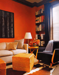
Steve Learner Studio, a New York based architecture and interior design firm began in 1995 and has had much success, resulting in many magazines publications such as Elle Decor, In Style Home, House & Garden and Interior Design. I love that they use neutral colour palettes in main spaces but bold vibrant colours in smaller spaces such as bathrooms. And hats off to them for using furniture in their designs that read modern but it all looks so plush and cosy.
 |  |
 |  |
 |  |
 |  |
 |  |
 |  |


 Tue, 4 Sep 2007
Reader Comments (5)
How lovely. But it's for the terminally neat. We clutterers would ruin it.
the blue tile- bathroom was just amazing, what a mesmerising colour!
I admit it. Hello. I'm terminally neat.
I am very attracted to all of these shots. The reflective floors, the stripey bathroom and, yes, that blue...ohhh, that blue!
I went to ogle more and I think you may have the link wrong...
Voila:
http://www.stevenlearnerstudio.com/
Thank you.
I'm terminally neat in a cluttered sort of way. :) Sorry about the link. It's fixed...thanks to AMR.
Love these rooms! The use of colour is amazing. Hang it, the use of neutrals is amazing!