This area does not yet contain any content.

Entries in reader's home (262)

Thursday
Nov042010

World's smallest bathroom

Here is an email we received from a reader named Mari: "I have the world's smallest bathroom. I tried a couple of things, but nothing's seem to work in it. The worst thing it's not its small size, but how the things are put together. I even had an architect to take a look, but there was no way to change the things out of their original place. The bathroom is 83cm x 2.40m. The shower is 80x80cm. I was wondering if you can get me some ideas." I honestly don't know what to say about this because it really is T. I. N. Y. My advice is blow out a wall but I'm guessing that ain't gonna happen. An architect friend of Mari's said that it would be possible to blow out the wall on the left, but when it was time to do it, it was discovered that that was some kind of building regulation against it. So if you guys have any ideas for Mari, fire away! (P.S. I did a "small bathroom" reader request a couple months back but I'm not sure that post would even help in this case).

Monday
Nov012010

Ike Bahadourian

Ike Bahadourian emailed us to share his Met loft remodel with custom furniture (Love his furniture designs! You'll find more on his website.) It's a spartan space but just right to spotlight Ike's beautiful rustic furniture pieces. I'll let him explain.

"The material choices and the layout were guided by the architecture of the space itself. As an open, rectangular loft the existing plan, fixtures and exposed ducts suggested at a linear layout that led your eyes to the balcony, to a view of Staples Center and LA Live. This meant the orientation of the bed, tables and couch would go accordingly. To complement the exposed ducts and pipes, as well as the cement walls, I chose reclaimed wood for the primary pieces of furniture to build with. A ten and a half foot cedar slab against the south wall simplifies the space by combining to serve as both a desk and a tv stand. Next to the table, stacks of the client's recycled wall street journals served as a stand for the dvd player. A reclaimed oak palette was cut in half to serve as a coffee table, with a piece of glass on top and subsequent cubby holes beneath for magazines or books. Six more reclaimed palettes were used to lift as a platform an area, or notch in the wall, that was designated for the bed. This lift separated it as much as possible from the rest of the space and created the only real break in the flow of the small apartment, and a bit of hierarchy. Half circle poplar wall mounts that serve as hangers hung across a Sevak Karabachian wood cut print in the sleeping area. Other pieces included Cb2 biloxi linens, west elm industrial lamps, and a gilbert chair from Ikea."

Click to read more ...

Wednesday
Oct062010

Reader's home - Federica's home in Italy

Federica recently sent us photos of her home in Italy so we could share them with our readers. It's beautiful with plenty of windows letting in natural light and was designed by her father Bruno Pogliani. Thank you Federica!

Wednesday
Sep292010

Reader's home

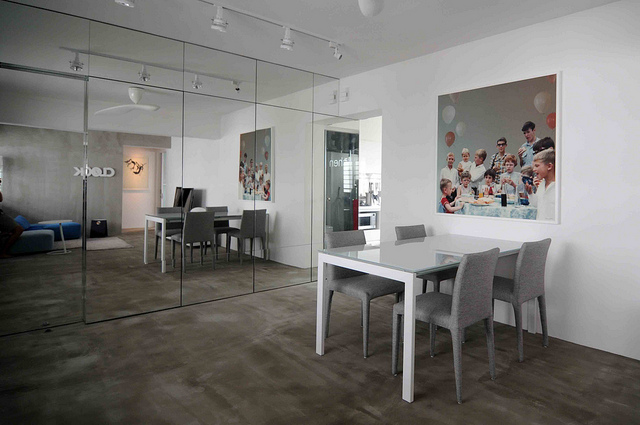
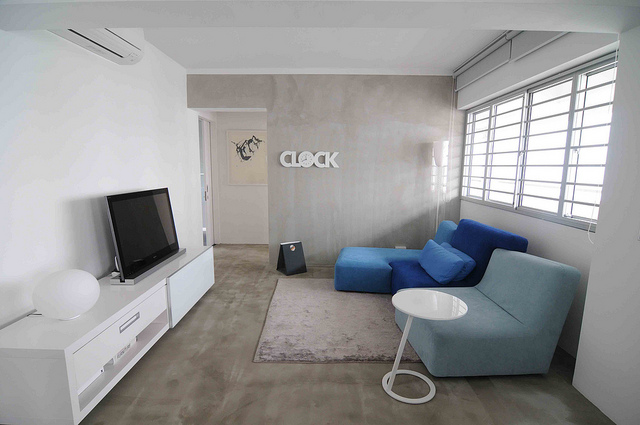
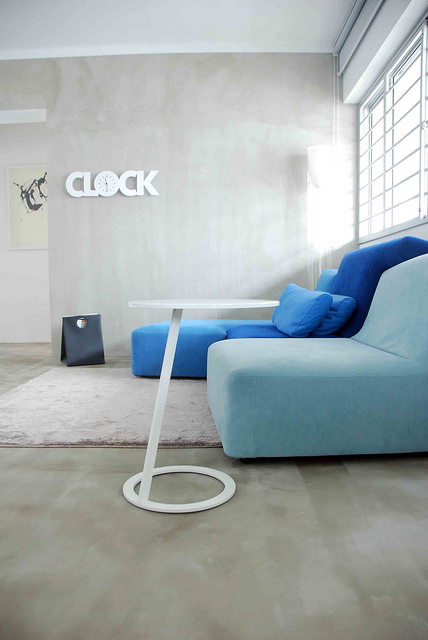
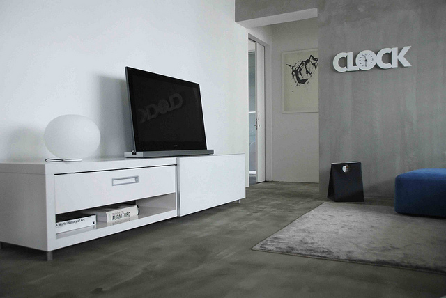
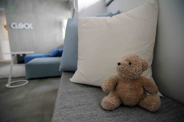
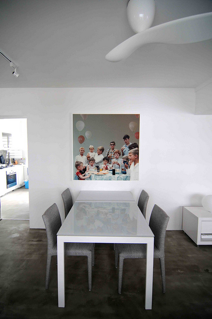
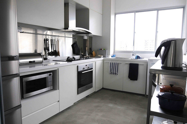
Paul and his wife Elsa have recently moved into their new home in Singapore (an 86m2 / 925 sq ft public housing apartment). Turning to magazines and blogs for inspiration they have created this fabulous minimalist apartment, a perfect respite from Singapore's hectic pace. Emailing with Paul he came up with an insight into Singapore's growing design scene.

Things have really started to move design and architecture-wise in Singapore over the past 5-6 years. Lots of interesting stuff now, but I think we are still some way away from finding our own design vernacular. There isn't a "Singapore" look, in the way that there is an American country-home look, or a Scandinavian aesthetic, or even the modern-Australian feel that so many of the Sydney and Melbourne homes that you have put up on your site have achieved. I guess it is a bit difficult with the cookie-cutter government housing flats that 80% of us live in, where everything is pre-fab. For a long time, the government was just trying to put together as much low-cost housing as possible to meet the demands of population growth. So build quality is alright, and the flats are relatively affordable, but they were absolutely zip in terms of design until recent years. More effort is being put in to the aesthetics of the new built flats now, but the one I just moved in to recently is about 10 years old, and was certainly built for function rather than form. I have always been a fan of mid-century modern and minimalist styles. What I tried to do with the flat is to keep it honest to its pre-fab / concrete / city-space background by taking on an industrial feel and meshing it with what the styles that I liked. It was challenging because neither my wife nor I have any background in design whatsoever, but really great fun. There are many other really interesting interpretations of public housing flats though – everything from modern baroque to faux-country house, and from Balinese resort to French petit-Chateau style. It will be interesting to see if all the different styles somehow converge into a "Singaporean" look in the future!

Click to read more ...

Tuesday
Sep212010

Reader's home

Reader Laurel Walter lives in southern Oregon and this is her fabulous home. These shots were taken by Matthew Millman (my earlier post on Matthew here) for a magazine feature. Laurel says her home is a trifecta project involving herself and Jennifer Bright, her partner in their interiors styling business, Twist, and Dewayne Lumpkin, owner of Home Economics. Unfortunately the magazine folded and Lauren's home remained unpublished but I am so jealous because Laurel has these amazing photos! I spy so much that I love. I'm ticking off the industrial items and found objects that I want for my place but most of all I'd kill for a wonderful outdoor room like Laurel's.

Click to read more ...